Te-Centralen
Anrik tebutik i Östersund och online
Leverans
Kreativt koncept
Mönsterillustration
Förpackningsdesign
Typografi
Varumärkesplattform
Byrå
Forever/
Frilans
Te-Centralen är en fysisk butik i Östersund som även länge verkar online. De efterfrågade en ny grafisk identitet som fångade både en organisk och unik identitet med koppling till te.
Strategi
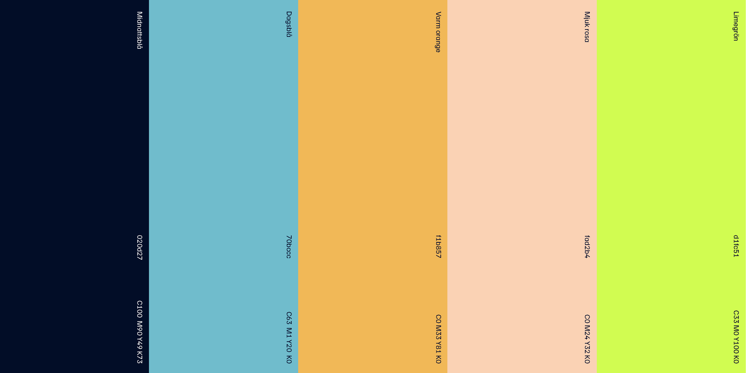
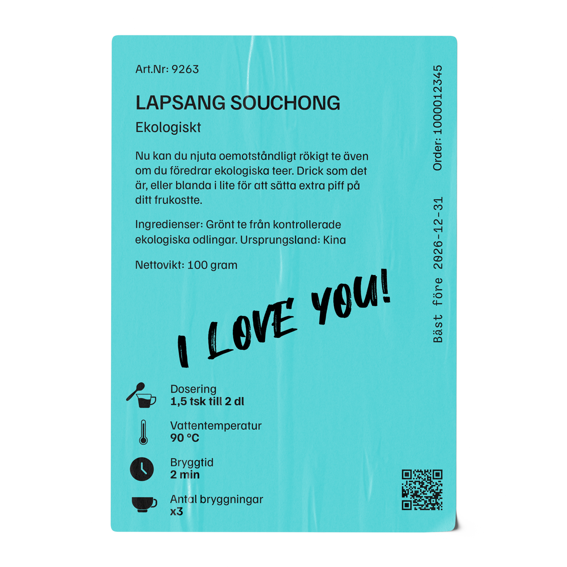
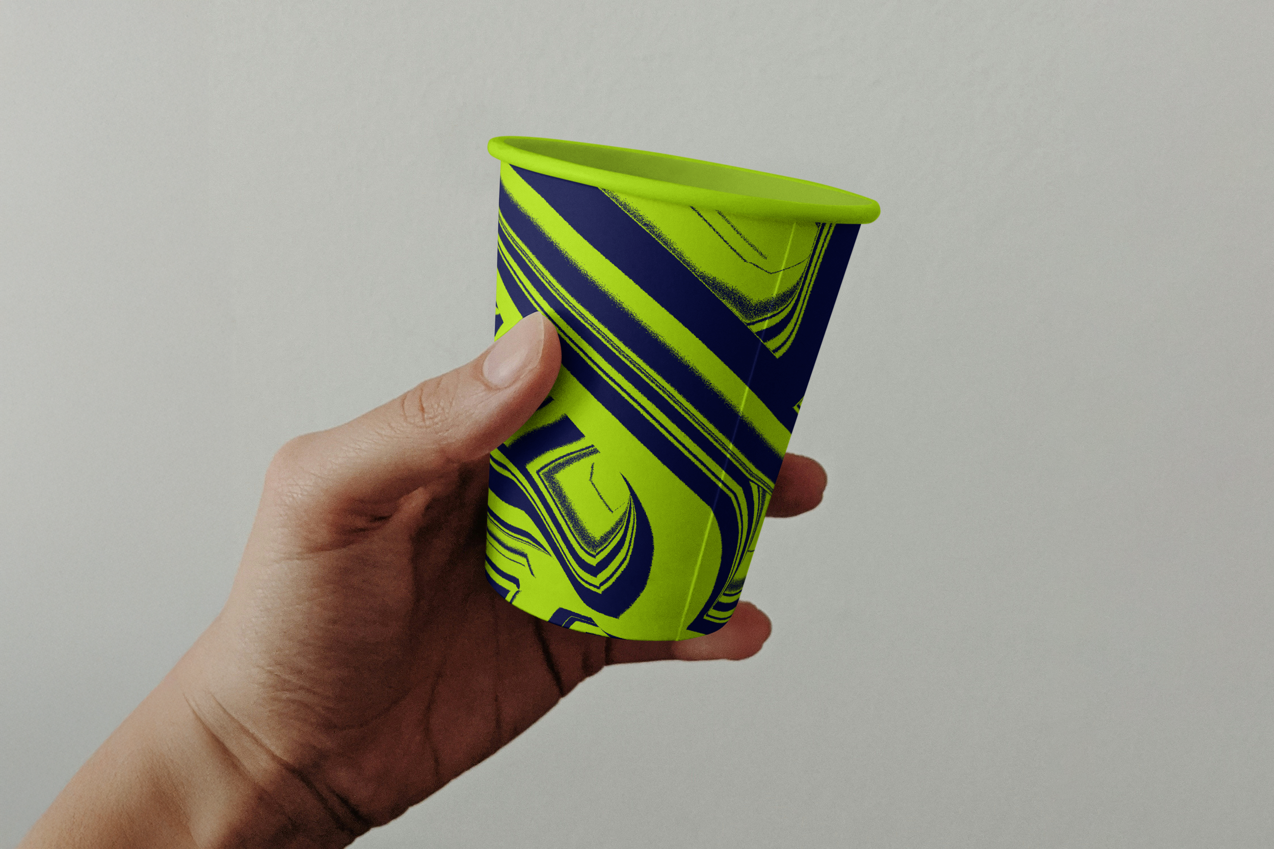
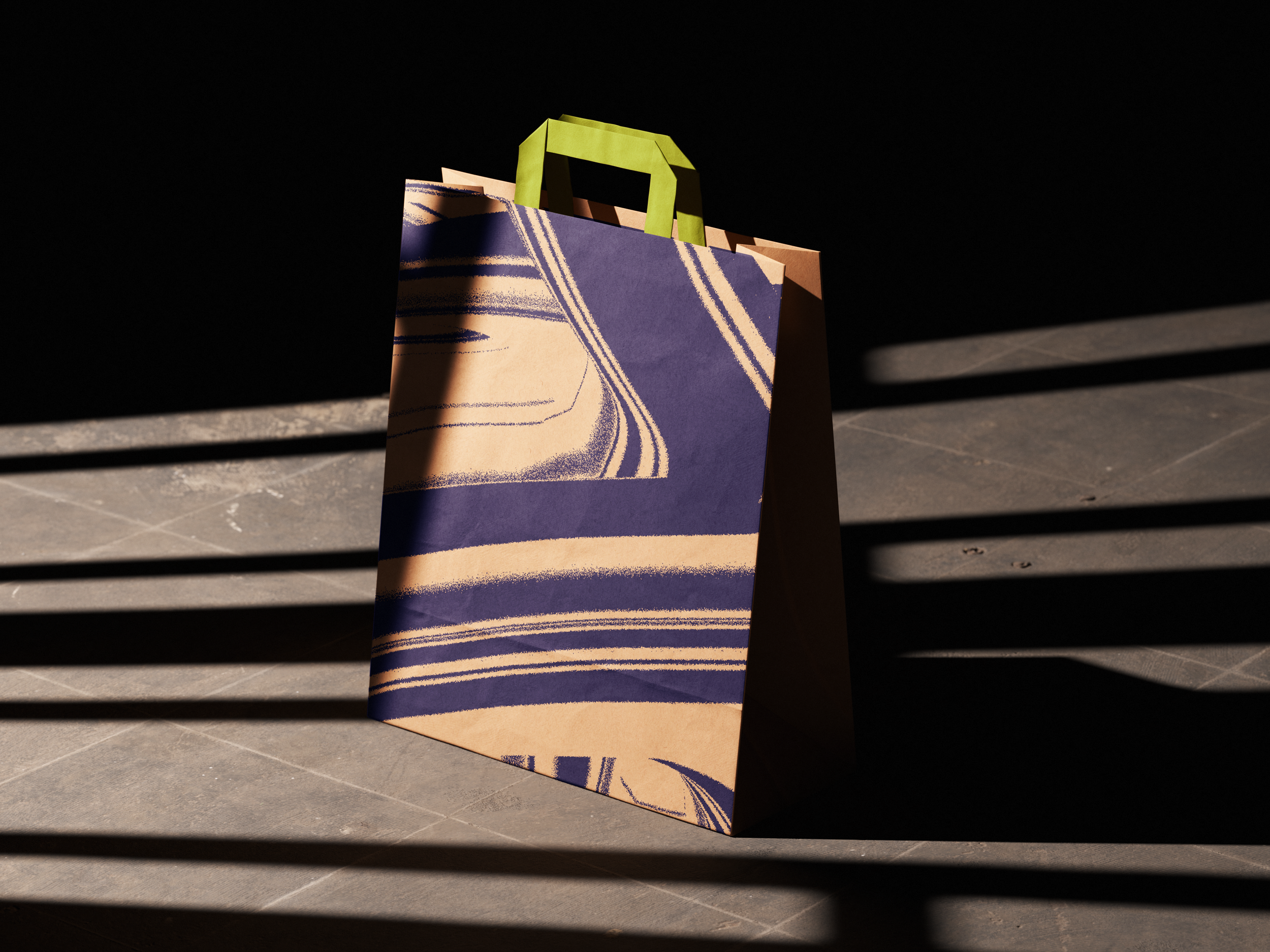
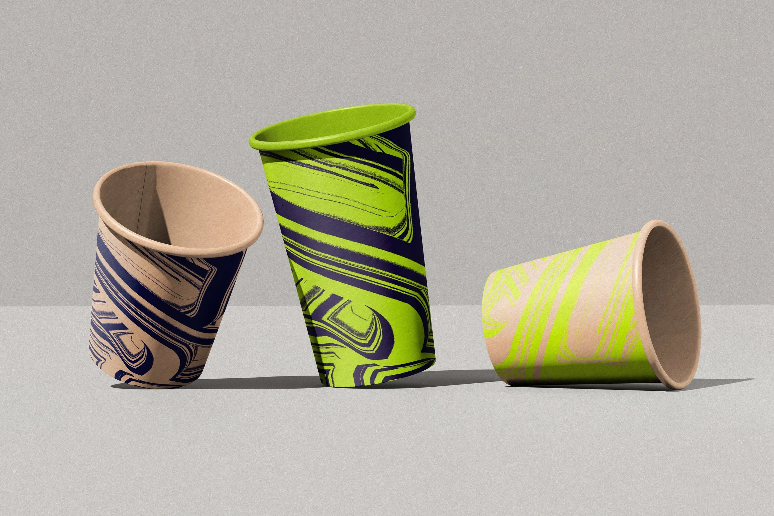
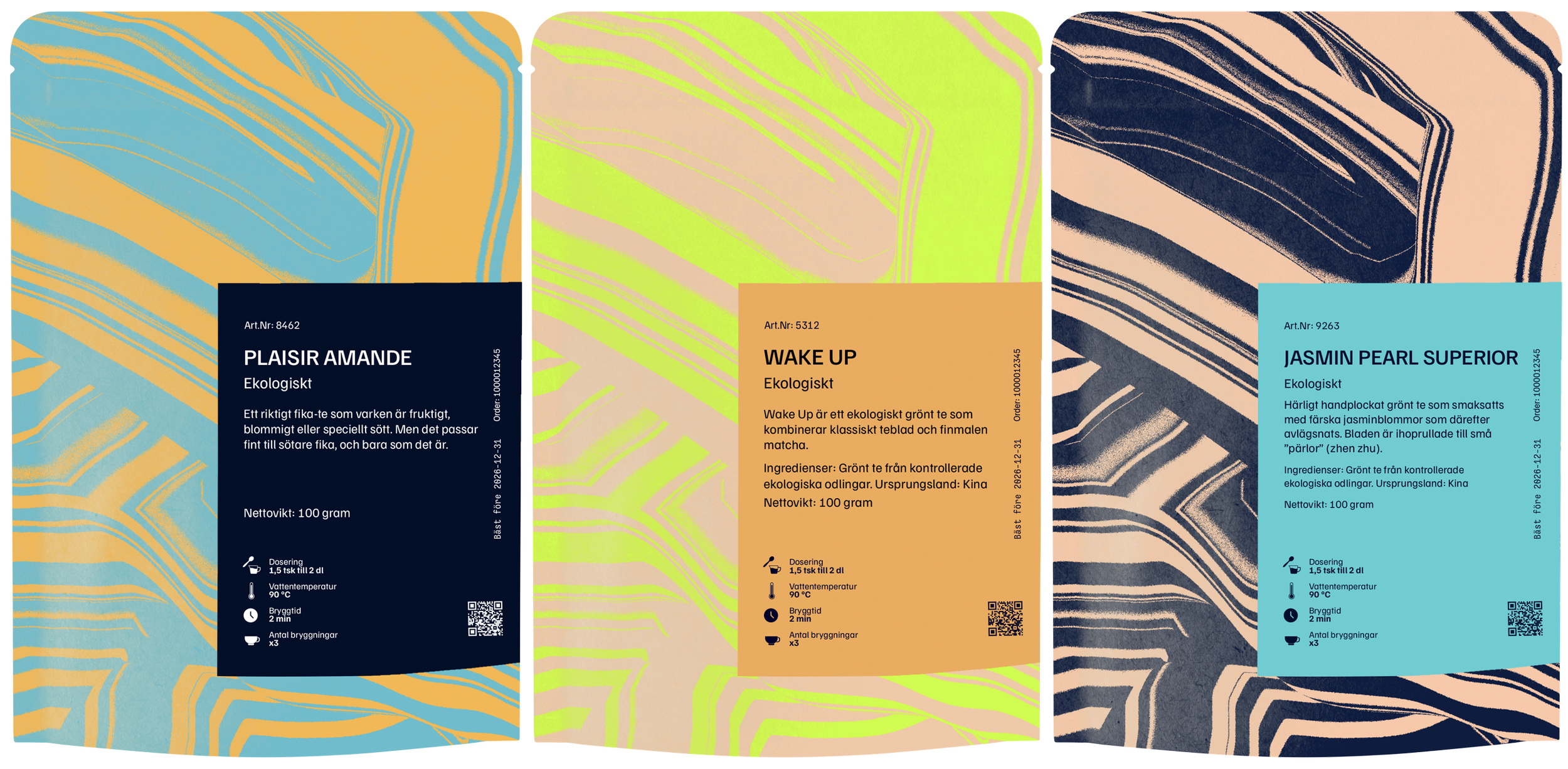
Färgpaletten bygger på kontrasten mellan det taktila och jordnära toner som möter intensiv lime och djupblå. Utöver sitt visuella uttryck fungerar färgerna som ett kodningssystem i etiketterna, där varje nyans signalerar innehållet och guidar användaren, samt skapar struktur i förpackningsprocessen.
Det organiska mönstret är inspirerat av vatten och ånga; en referens till teets natur, och fungerar som en bärande identitetsmarkör. Genom att följa med ut från butiken, på förpackningar som syns i vardagen, blir det en naturlig förlängning av varumärket i stadsmiljön.
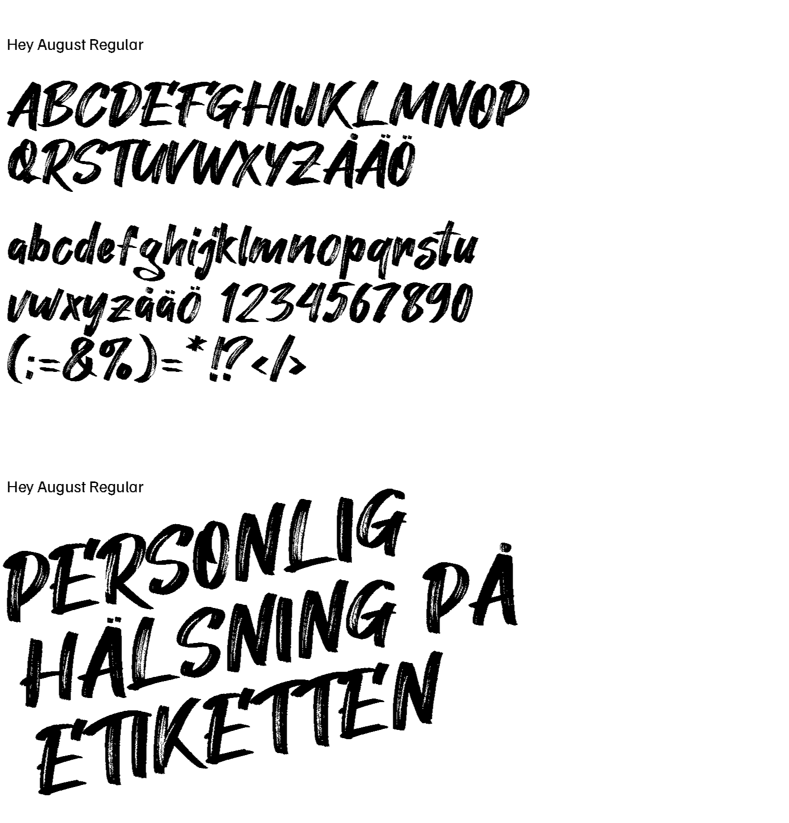
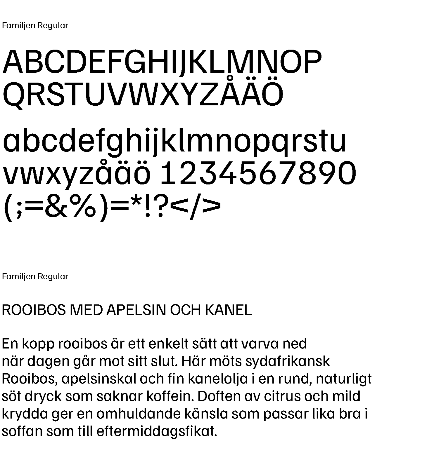
Typografin balanserar tydlighet med personlighet. Huvudtypsnittet är rent och självsäkert, medan det kompletterande typsnittet adderar en mer funky ton i form av personliga hälsningar på etiketterna.
Effekt
Den nya varumärkesplattformen gav tebutiken en tydligare riktning, från en traditionell butik till ett samtida, igenkännbart varumärke.
Genom att definiera kärnan i verksamheten, tonalitet och visuellt uttryck skapades en helhet som håller ihop upplevelsen i alla kontaktpunkter.
Plattformen ligger till grund för allt från identitet och förpackningar till kommunikation och butiksmiljö. Den gör det enklare att vara konsekvent, men också att utvecklas över tid utan att tappa igenkänning.
Resultatet är ett varumärke som är mer distinkt, mer relevant i sin kontext och lättare att ta till sig, både för nya och återkommande kunder.